Hi there, I am Shikhar
Let me take you through some of my work and the process behind them
Logo Design For the Music Band Loud Neighbours
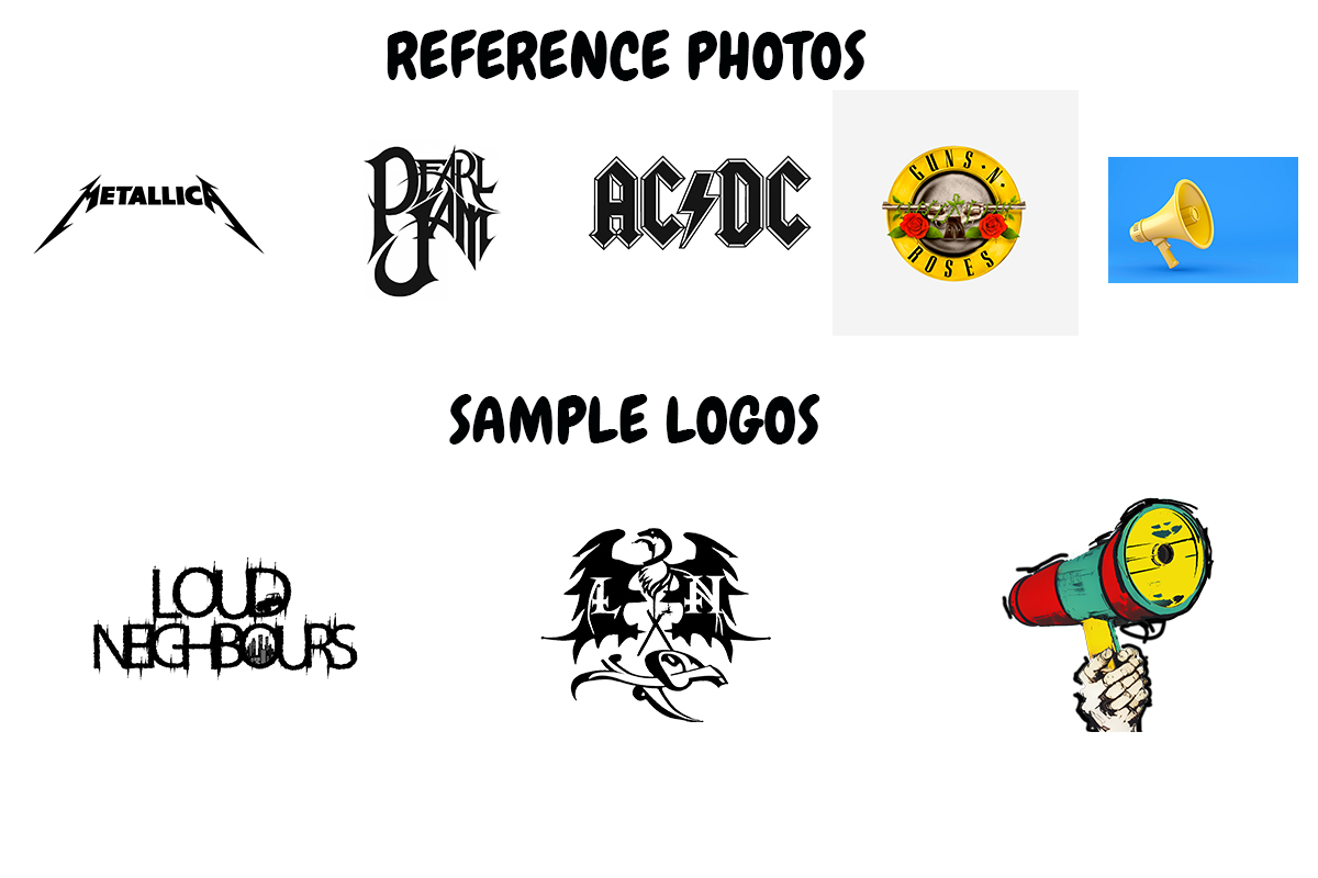
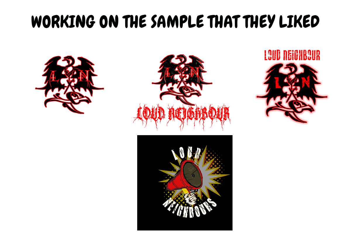
I got an e-mail from the main man of the band Joyonto Doley, they wanted a logo for their Band that would represent the band members and the type of music they were going to play. The vision they had was they needed a megaphone in the logo, they wanted it to be the main attraction but they were also open for other ideas. The first thing I did was make samples to show them inspired by the many different reference photos that they sent me.


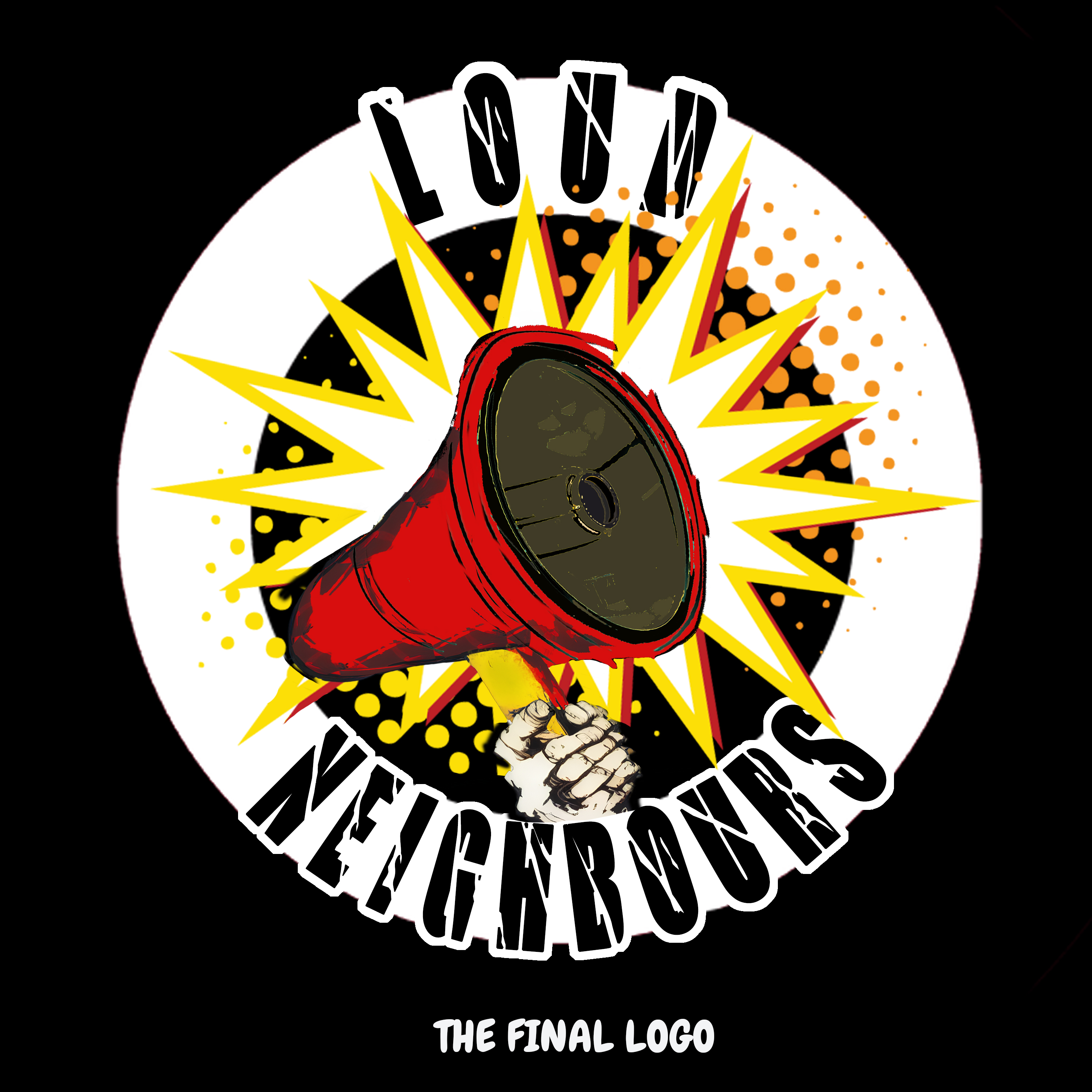
They really liked the final outcome, the logo had the megaphone that they always wanted. The logo had this fun, funky feel to it with the red and yellow colors popping out giving it the loud in a fun lets dance and sing along vibe to it. The backdrop behind the megaphone symbolises being loud which is the name of the band and the hand holding the megaphone shows a sense of power and energy like you are in for a powerpack performance
A Simple Responsive Web Page for a School Student`s Project
I was contacted by a school student via the website Chegg, she wanted a simple one page website for an International Food Festival event at there school. She was making anime inspired japanese food and she needed a website to go along with her temporary shop so I had to make this website in a day, I had 6 hours to build the entire thing and deliver it to her. The food she was serving was inspired by the very famous movies/series by Studio Ghibli.

.png)
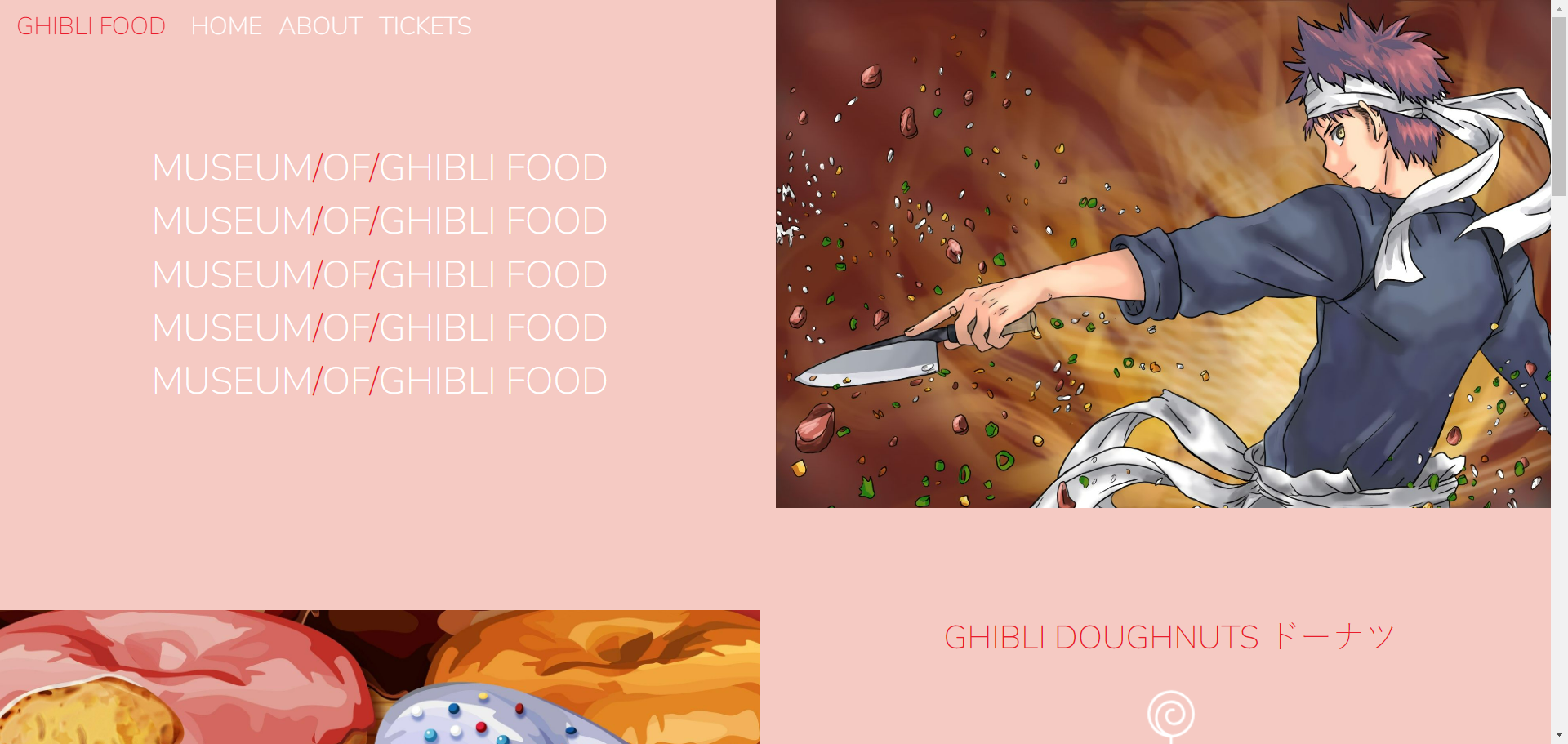
This was basically an interactive online menu for the shop, I went for a simple clean minimalistic look and intentionally laid out all the content in a way that it felt spacious and not cramped. The color pallete of the webpage and the font style was also picked keeping that in mind. My main goal was to create a website with less load time which will work seamlessly in any device. I added the ingredients and process of the food that she was serving, you can also see the navbar changing color when you scroll down.
.png)
.png)
.png)
As you can see the website is responsive, it worked efficiently in all the device it was used in. When used in a smaller screen the home, about and ticket section collapses into the hamburger icon (the three horizontal bar on the right), the images also moves into different places in a smaller screen to maintain that spacious and clean feel of the webpage. It never feels cramped and maintains the user experience throughout. Safe to say the project was a success.
Leave a comment